
Friday, June 10, 2011
Wednesday, June 8, 2011


VIEWS
With the proposed gallery and house, I designed to achieve the best and most suitable views of the city from the buildings.
Image 1 : The buildings entry is very simple in a sense that it conforms with the neighbouring buildings. Typical windows and storefront approach, the entry is i believe, best suited for Victoria Street.
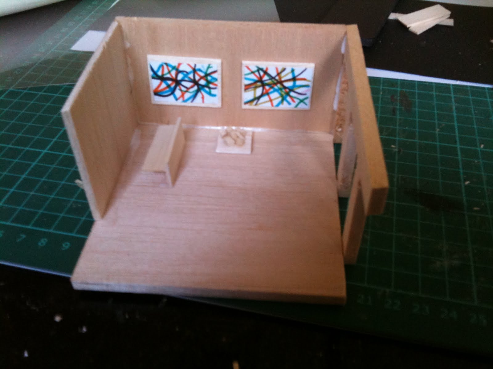
Image 2: The ground floor of the art gallery consists of a cafeteria. The city can be seen from the cafeteria allowing for visitors to have a small break and enjoy the city view. Although the house is to some degree obstructing the view from the cafeteria, other parts of the city can be seen from this point.
Image 3: The gallery itself. Running on street level, this is the best possible view of the city life from within the gallery. Also, the adjacent stairs have quite similar views.
Image 4: The entry of the house is secluded as the house is for private use only, rented by a friend of the gallery owner. The window on the left side of the building foresees the majority of the city. Exiting the house allows for a delightful view of the city as to get out of the building, one must walk towards the city with an unobstructed view.
STRUCTURE
The structure of both buildings is typically load baring with the walls on ground, street and first floor carrying the majority of the weight. However, Columns are also apparent within the cafeteria to provide support. Timber studs are used for decoration purposes as seen on the street level. However, the timber studs used with the house provides more than decoration purposes. The timber studs are placed on a certain angle (facing the city) to provide an enhanced privacy view of the city. From outside the house, you can only see within the house from that particular window if you are leaving the house.
Relation to Precedent study: Carlos Size House
The most prominant part of the Siza House is the courtyard formation, as it is responsible for the overall circulation and arrangement of spaces across the house. The spaces are defined by a very simple arrangement of walls to an extent where one would have to go around the entire courtyard formation to get from one side of the house to the other. I tried to explore this similarly by having the circulation of the back house (behind the gallery) to start from one end and finish at the other. To get from one side of the house to the other, the individual must walk around the entry formation with the corridor like pathway in order to get to their desired destination. The entry to the house is secluded to maximise privacy and the entire building somewhat engulfs the visitor as they enter the house.


Monday, May 16, 2011


Sunday, May 1, 2011


NOTES (CARLOS SIZA HOUSE)
YUNIS ASAAD 3292390
Model:
Program with importance of spaces: The model depicts the major areas of the house. The squared box at the top represents the Master Room, which is seen as the 'over looker' of the house. It can be called the control room of the house, as it over looks to protect the kids house but is also situated at a position where it is so critical to the privacy of certain areas of the house. The childrens bedroom, which the main outer wall is represented by smaller colomns because this room is the most private area of the house. It is overlooked by the master room, but it is also protected with the numerous surrounding walls. I tried to represent the room as it is in a small cage that is protected by other over whelming elements of the house. The other elevated material of the house represents the public space of the house
Circulation:
I tried to demonstrate how the circulation works in this building by using a continious proportional circular shape that surroundes the most prominant part of the building that structures the path of the circulation around the house (the courtyard function). The circle in the centre represents the path a person would take to get from one side to the other of the house. Ive also distored the line of the shape to represent the sub paths taken by a visitor. With so many smaller walls sitting in different orientations, the circulation becomes some what 'lost' other then the main circulation (circle) which is why i dashed the line in the more private part of the house. Also, the shading within the shape shows the more public circulation (lighter part) compared to the private circulation (darker side). Th red lines represent the circulation path from the main structural element of the building.
Internal / External Relations:
Distinguished by the textural surface used, the internal space is structured according to the more prominant courtyard formation. The program of the building is designed according to the organisational relationship between the internal and external spaces. So, the most private area of the house (the kids bedroom) is covered with green lines to represent the enclosure the room is in as both the internal walls and the exterior larger walls work together to attach a secluded, confidential area. The yellow lines represent how the external space has provided a significant description from within the house to display certain views from within the house
Thursday, April 28, 2011


Subscribe to:
Posts (Atom)