Friday, June 10, 2011
Wednesday, June 8, 2011
VIEWS
With the proposed gallery and house, I designed to achieve the best and most suitable views of the city from the buildings.
Image 1 : The buildings entry is very simple in a sense that it conforms with the neighbouring buildings. Typical windows and storefront approach, the entry is i believe, best suited for Victoria Street.
Image 2: The ground floor of the art gallery consists of a cafeteria. The city can be seen from the cafeteria allowing for visitors to have a small break and enjoy the city view. Although the house is to some degree obstructing the view from the cafeteria, other parts of the city can be seen from this point.
Image 3: The gallery itself. Running on street level, this is the best possible view of the city life from within the gallery. Also, the adjacent stairs have quite similar views.
Image 4: The entry of the house is secluded as the house is for private use only, rented by a friend of the gallery owner. The window on the left side of the building foresees the majority of the city. Exiting the house allows for a delightful view of the city as to get out of the building, one must walk towards the city with an unobstructed view.
STRUCTURE
The structure of both buildings is typically load baring with the walls on ground, street and first floor carrying the majority of the weight. However, Columns are also apparent within the cafeteria to provide support. Timber studs are used for decoration purposes as seen on the street level. However, the timber studs used with the house provides more than decoration purposes. The timber studs are placed on a certain angle (facing the city) to provide an enhanced privacy view of the city. From outside the house, you can only see within the house from that particular window if you are leaving the house.
Relation to Precedent study: Carlos Size House
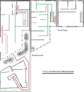
The most prominant part of the Siza House is the courtyard formation, as it is responsible for the overall circulation and arrangement of spaces across the house. The spaces are defined by a very simple arrangement of walls to an extent where one would have to go around the entire courtyard formation to get from one side of the house to the other. I tried to explore this similarly by having the circulation of the back house (behind the gallery) to start from one end and finish at the other. To get from one side of the house to the other, the individual must walk around the entry formation with the corridor like pathway in order to get to their desired destination. The entry to the house is secluded to maximise privacy and the entire building somewhat engulfs the visitor as they enter the house.


